


css弹性布局-常见示例篇
更新时间: 2022-04-11 23:28:48
点击量: 1310
简介:写一批布局中常见的示例,当然弹性布局能做到的不止如此,此处只列举的常见的,可自行和之前的布局方式做比较看如何方便,如何简洁
文章均为个人原创, 搬运请附上原文地址感谢, 原文来自MasterYi博客
常见的弹性布局例子
例子(一)
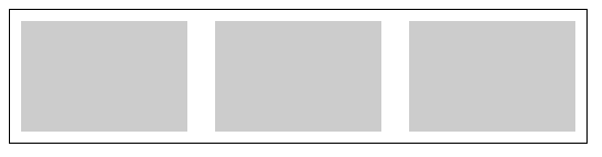
<style>
    .box {
        width: 500px;
        height: 100px;
        border: 1px solid;
        padding: 10px;
        display: flex;
        justify-content: space-between;
    }
    .box div {
        width: 150px;
        background: #CCC;
    }
</style>
<body>
    <div class="box">
        <div></div>
        <div></div>
        <div></div>
    </div>
</body>
例子(二)
- 这类型的布局会比较常见, 我们只需改变主轴为垂直方向,自动换行,分配一下高度即可,就可轻松解决这种布局
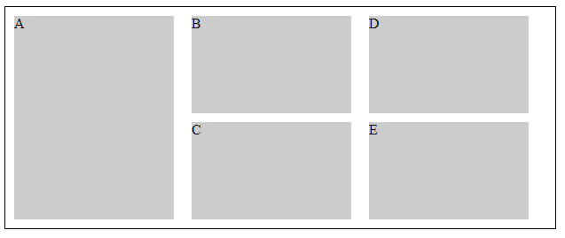
<style>
    .box {
        width: 600px;
        height: 230px;
        border: 1px solid;
        padding: 10px;
        display: flex;
        flex-wrap: wrap;
        justify-content: space-between;
        flex-direction: column;
    }
    .box div {
        width: 180px;
        height: 110px;
        background: #CCC;
    }
    .box div:nth-child(1){
        height: 100%;
    }
</style>
<body>
    <div class="box">
        <div>A</div>
        <div>B</div>
        <div>C</div>
        <div>D</div>
        <div>E</div>
    </div>
</body>
例子(三)
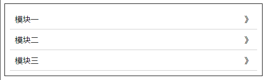
<style>
.box {
width: 500px;
height: auto;
border: 1px solid;
padding: 10px;
}
.box .item{
display: flex;
justify-content: space-between;
border-bottom: 1px solid #ccc;
padding: 10px;
}
</style>
<body>
<div class="box">
<div class="item">
<div>模块一</div>
<div>》</div>
</div>
<div class="item">
<div>模块二</div>
<div>》</div>
</div>
<div class="item">
<div>模块三</div>
<div>》</div>
</div>
</div>
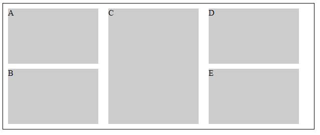
</body>例子(四)
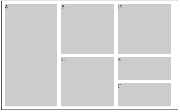
<style>
    .box {
        width: 550px;
        height: 330px;
        border: 1px solid;
        padding: 10px;
        display: flex;
        flex-wrap: wrap;
        justify-content: space-between;
        flex-direction: column;
    }
    .box div {
        width: 170px;
        height: 160px;
        background: #CCC;
    }
    .box div:nth-child(1){
        height: 100%;
    }
    .box div:nth-child(5), .box div:nth-child(6){
        height: 75px;
    }
</style>
<body>
    <div class="box">
        <div>A</div>
        <div>B</div>
        <div>C</div>
        <div>D</div>
        <div>E</div>
        <div>F</div>
    </div>
</body>
例子(五)
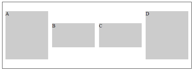
<style>
    .box {
        width: 600px;
        height: 200px;
        border: 1px solid;
        padding: 10px;
        display: flex;
        flex-wrap: wrap;
        justify-content: space-between;
        align-items: center;
    }
    .box div {
        width: 140px;
        height: 160px;
        background: #CCC;
    }
    .box div:nth-child(2), .box div:nth-child(3){
        height: 80px;
    }
</style>
<body>
    <div class="box">
        <div>A</div>
        <div>B</div>
        <div>C</div>
        <div>D</div>
    </div>
</body>
例子(六)
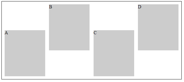
<style>
    .box {
        width: 600px;
        height: 250px;
        border: 1px solid;
        padding: 10px;
        display: flex;
        flex-wrap: wrap;
        justify-content: space-between;
    }
    .box div {
        width: 140px;
        height: 160px;
        background: #CCC;
    }
    .box div:nth-child(2n - 1){
        align-self: flex-end;
    }
</style>
<body>
    <div class="box">
        <div>A</div>
        <div>B</div>
        <div>C</div>
        <div>D</div>
    </div>
</body>