


css交互篇-animation
更新时间: 2022-05-20 22:41:57
点击量: 1337
简介: 动画真正需要学习的地方在于如何分解动画的变化节点,也就是创建我们 @keyframes 中的变化节点,从而去产生我们需要的动画效果
文章均为个人原创, 搬运请附上原文地址感谢, 原文来自MasterYi博客
本篇知识点
@keyframes
该属性表示创建一个动画, 决定动画的执行过程会产生哪些样式变化
animation
绑定一个动画, 规定动画的执行时间、次数、动画曲线、延时执行
其实动画需要记得属性很少,也无需死记, 动画真正需要学习的地方在于如何分解动画的变化节点,也就是创建我们 @keyframes 中的变化节点,从而去产生我们需要的动画效果
1. animation 属性介绍
| 属性 | 描述 |
|---|---|
| animation | 所有动画属性的简写属性 |
| animation-name | @keyframes 动画的名称 |
| animation-duration | 定义过渡效果花费的时间。默认是 0 单位可以 s 或 ms |
| animation-timing-function | 规定动画过渡效果的时间曲线。默认是 "ease" |
| animation-fill-mode | 规定动画完成播放后会停留在哪里, 无限播放时无效 |
| animation-delay | 规定动画何时开始。默认是 0。 |
| animation-iteration-count | 规定动画被播放的次数。默认是 1。 infinite 代表无限播放 |
| animation-direction | 规定动画是否在下一周期逆向地播放。默认是 "normal"。 |
| animation-play-state | 规定动画是否正在运行或暂停。默认是 "running"。 |
- 需要留意一下的属性就是timing-function, 代表动画的过渡曲线,可以决定你效果的过渡方式
| 值 | 描述 |
|---|---|
| linear | 规定以相同速度开始至结束的过渡效果 |
| ease | 规定慢速开始,然后变快,然后慢速结束的过渡效果 |
| ease-in | 规定以慢速开始的过渡效果 |
| ease-out | 规定以慢速结束的过渡效果 |
| ease-in-out | 规定以慢速开始和结束的过渡效果 |
| cubic-bezier(n,n,n,n) | 贝塞尔曲线, 自定义自己的值。可能的值是 0 至 1 之间的数值。 |
2. 代码示例
- 将结合实例来对每一个属性的实际用途进行讲解
2.1 timing-function
- 属性过渡曲线总览
<style>
    .box { display: flex; }
    .box div{ width: 100px; height: 50px; background: black;  color: white; position: relative; animation: drop 5s 1 forwards 2s; margin: 5px; text-align: center; line-height: 50px; }
    .box div:nth-child(1){ animation-timing-function: linear; }
    .box div:nth-child(2){ animation-timing-function: ease;  }
    .box div:nth-child(3){ animation-timing-function: ease-in;  }
    .box div:nth-child(4){ animation-timing-function: ease-out;  }
    .box div:nth-child(5){  animation-timing-function: ease-in-out; }
    @keyframes drop {
        from { top: 0; }
        to { top: 300px; }
    }
</style>
<body>
    <div class="box">
        <div>linear</div>
        <div>ease</div>
        <div>ease-in</div>
        <div>ease-out</div>
        <div>ease-in-out</div>
    </div>
</body>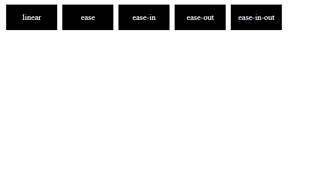
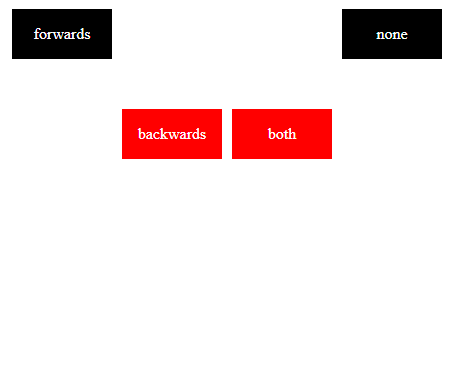
2.2 animation-fill-mode
- 属性为 backwards 可越过 animation-delay 等待期间便达到第一帧的位置
- 属性为 forwards 时 动画结束后 元素将停滞在结束帧的位置
- 属性为 both 同时遵循 forwards 和 backwards 的规则
<style>
    .box { display: flex; }
    .box div{ width: 100px; height: 50px; background: black;  color: white; position: relative; animation:drop 3s 1; animation-delay: 2s;  margin: 5px; text-align: center; line-height: 50px; }
    .box div:nth-child(1){ animation-fill-mode: forwards; }
    .box div:nth-child(2){ animation-fill-mode: backwards;  }
    .box div:nth-child(3){ animation-fill-mode: both;  }
    @keyframes drop {
        from{ top: 100px; background: red; }
        to{ top: 300px; background: #1e9fff; }
    }
</style>
<body>
    <div class="box">
        <div>forwards</div>
        <div>backwards</div>
        <div>both</div>
        <div>none</div>
    </div>
</body>- 动画初始位置在顶部 ,下落动画
2.3 animation-iteration-count
- 关于如何循环播放的问题
- 需要动画循环播放之时我们便会用到 animation-iteration-count 属性设置次数, 或者 infinite 无限次
- 但是为了避免重复执行时 有生硬的闪动, 也会用到一个属性 animation-direction 属性定义是否循环交替反向播放动画
<style>
    .box div{ width: 150px; height: 150px; line-height: 150px; margin: 5px; text-align: center; background: black;  color: white; position: relative; animation:move 1.5s; }
    .box div:nth-child(1){ animation-iteration-count: infinite; }
    .box div:nth-child(2){ animation-iteration-count: infinite; animation-direction: alternate;  }
    @keyframes move {
        from{ left: 0; }
        to{ left: 300px; border-radius: 50%; }
    }
</style>
<body>
    <div class="box">
        <div>infinite</div>
        <div>infinite + alternate</div>
    </div>
</body>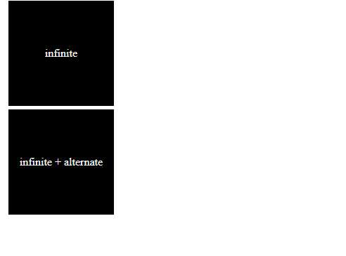
了解上述的属性 ,animation动画属性也了解的差不多了,其余属性基本上都是数值型的不需要解释,我们做动画的方法就是分解动画帧, 编写@keyframes的过程
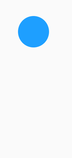
2.4 掉落的小球
- 分解思路, 元素需要球和阴影, 模拟掉落的弹起,设置逐渐拉近的top值差, 阴影跟随高度 进行 大小 透明度变化
<style>
    body { padding: 50px; }
    .ball{ width: 100px; height: 100px; background: #1e9fff; border-radius: 50%; position: relative; animation: bounce 2.1s ease-in-out; animation-delay: 2s; animation-fill-mode: forwards; z-index: 1; }
    @keyframes bounce {
        0% { top: 0; }
        40% { top: 300px; }
        50% { top: 130px; }
        60% { top: 300px; }
        68% { top: 190px; }
        76% { top: 300px; }
        82% { top: 240px; }
        88% { top: 300px; }
        96% { top: 280px; }
        100% { top: 300px;}
    }
    .shaow { width: 100px; height: 20px; background: #ccc;border-radius: 50%; position: relative; top: 290px; animation: shaow 2.1s ease-in-out; animation-delay: 2s; animation-fill-mode: both; }
    @keyframes shaow {
        0% { transform: scale(0.2); opacity: 0.1; }
        40% { transform: scale(1); opacity: 1; }
        50% { transform: scale(0.4); opacity: 0.4; }
        60% { transform: scale(1); opacity: 1; }
        68% { transform: scale(0.6); opacity: 0.6;}
        76% { transform: scale(1); opacity: 1; }
        82% { transform: scale(0.8); opacity: 0.8; }
        88% { transform: scale(1); opacity: 1; }
        96% { transform: scale(0.92); opacity: 0.92; }
        100% { transform: scale(1); opacity: 1; }
    }
</style>
<body>
<div class="ball"></div>
<div class="shaow"></div>
</body>